


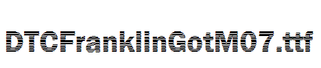


LFT-Etica-Mono
字体介绍
品牌:TypeTogether设计师:Leftloft发行时间:2020字库编码:Unicode分类:无衬线体字体属性:精品字
英文名称:LFTEticaMono-Regular.TTF、LFTEticaMono-Light.TTF、LFTEticaMono-LightItalic.TTF、LFTEticaMono-RegularItalic.TTF、LFTEticaMono-Book.TTF、LFTEticaMono-BookItalic.TTF、LFTEticaMono-Semibold.TTF、LFTEticaMono-SemiboldItalic.TTF、LFTEticaMono-Bold.TTF、LFTEticaMono-BoldItalic.TTF
总部位于米兰的Leftloft工作室制作了其热门字体系列的第三个分支:LFT Etica Mono。它是一种更广泛、更通用的字体,已经包含了近80种衬线和非衬线字体。
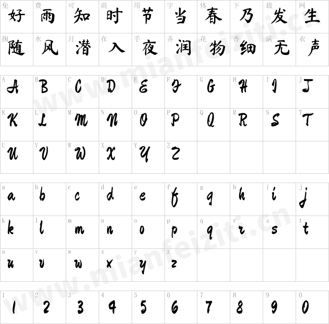
LFT Etica Mono的十个字重承载着Etica系列相同的现代,可识别的DNA,同时满足了编码字体的定义要求:空间,密度,独特形式和清晰度。 它在'c'使用相同的笔触和开放式'a'而闻名家族,以意大利斜体形式添加了一些新内容。
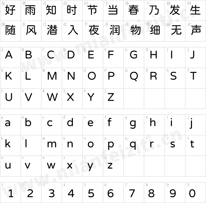
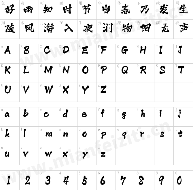
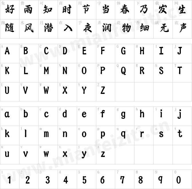
等宽字体通常与LFT Etica Mono一样将倾斜的字母合并为斜体,但是其默认斜体具有较温和的草书形状,而其他斜体只是简单地倾斜。 默认的“ a”是简化了字碗和字干,而不是两层的形状;“ d,f,i,l,t,y”和其他标记的尾端运用直的笔触; “ e”是一个平滑的笔触; 并且默认的“ k”是环状的。 如果不需要草书外观,这些字符具有基本的倾斜替代字符,并包括一组箭头和几何形状。 从本质上讲,等距设计使字体在编码和低可读性情况下更有用。
从设计师的角度来看LFT Etica Mono是如何工作的?我们的出发点是需要用于技术应用的等距LFT Etica部件:图形布局中的标题,小文本,有限或预定的空间以及整体色调。扁平的笔画端点和字腔可保持原始字体的颜色和多功能性,使在有机草书或钝的倾斜字母之间进行选择将使每种布局都有自己的特色。还具有特殊审美趣味的&和%符号。
新的LFT Etica Mono字体系列是为应用于普通的视觉环境而设计的,它完成了一个更复杂的系统。这样做的一个好处是可以表达一种情绪—不严肃,更友好,—给一些固有的技术、字节和机器人去编码美好的生活。
Milan-based Leftloft studio has produced a third leg to its hit Etica font family: LFT Etica Mono. Meant to be a coder’s go-to font for everyday use as much as a designer’s way to invoke a certain genre, it is part of a broader and more versatile family that already contains almost 80 sans and serif fonts.
LFT Etica Mono’s ten weights carry the same modern,recognisable DNA of the Etica family while hewing to the defined requirements of a coding typeface: space, density, distinct forms, and clarity. It uses the same instroke on the ‘c’ and open form of
the ‘a’ for which the Etica family is famous, but adds something new in the form of an additional italic style.
Monospaced fonts usually incorporate slanted letters as italics, as does LFT Etica Mono, but its default italics have warmer, cursive shapes while the alternate italics are simply slanted. The default ‘a’ is a simplified bowl and stem instead of a two
storey shape; the ‘d, f, i, l, t, y’ and others gain an outstroke tail; the ‘e’ is one smooth stroke; and the default ‘k’ is looped. These characters have basic,
slanted alternates if the cursive look isn’t desired, and includes a set of arrows and geometric shapes. The monospaced design, by nature, makes the typeface useful in coding and in low readability situations.
And how does LFT Etica Mono work from the designer’s perspective? The starting point was the need for a monospaced LFT Etica companion intended for technical applications: captions in graphic layouts, small text, confined or predefined space, and overall tone. Flat terminals and counters maintain the colour and versatility of the original typeface, but choosing between the organic cursive or blunt slanted alphabet will give every layout its own character. Of particular aesthetic interest may be the & and % symbols.
Designed to be applied to the common visual environment, the new LFT Etica Mono font family completes a more complex system. One benefit is to give an expressive tone — less serious and more friendly — to something inherently technical, to bytes and bots, to encode the beautiful life.
字体下载
特别提示:
1、本站所有字体仅供个人学习和研究使用,禁止任何商业应用!如需商业用途请自行购买字体的商用授权;
2、一切因使用本站而引致任何意外、疏忽、合约毁坏、诽谤、版权或知识产权侵犯等及其所造成的损失,本站概不负责,亦不承担任何法律责任;
3、本站是一个非赢利性的网站,目的是为优秀的字体进行展示宣传,若侵犯了您的权利,请来信告知,我们将立即处理;如果想在本站展示字体也请与我们联系。
4、联系我们:
LFT-Etica-Mono:等您坐沙发呢!