


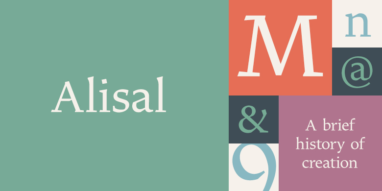
Alisal™
字体介绍
品牌:Monotype设计师:Carter,Matthew发行时间:2008字库编码:Unicode分类:衬线体字体属性:
英文名称:zhuan_AlisalPro-Regular.TTF、zhuan_AlisalPro-Regular.TTF、zhuan_AlisalPro-Italic.TTF、zhuan_AlisalPro-Italic.TTF、zhuan_AlisalPro-Bold.TTF、zhuan_AlisalPro-Bold.TTF
Matthew Carter说,他一直在完善Alisal的设计,以至于当他被要求来完成Monotype Library的设计时,感觉就像是在对自己的字体进行历史性的复刻一样。这种感觉甚至延伸到他的工作过程中的变化:尽管他现在已经在屏幕上完成了所有初始版本和最终版本的绘制,但Alisal的第一个试用版效果图是用铅笔完成的。
Alisal最适合归类为意大利老式设计。真正的意大利老式风格最早出现于15世纪末至16世纪中期的意大利北部,是最早的罗马风格。它们往往是衬线字体中最具书法特色的,其弯曲笔画的轴线向左倾斜,像是用平头的笔或笔刷绘制的一样。这些设计具有坚固、流畅且明显弯曲的衬线,下伸部较短且笔画粗细对比适中。
Alisal几乎拥有所有经典的意大利老式风格特征,再加上自己的一些怪异的特点。它本质上是书法的,比诸如Palatino或Goudy Old Style之类的字体更像是钢笔绘制的。它比Goudy的Kennerley或Benton的Cloister更粗糙,而且字重通常比其他大多数意大利老式设计要粗。Alisal与传统的老式设计完全不同的地方是衬线。虽然粗狂且清晰地反映了钢笔绘制笔画,但Alisal的衬线没有弯曲,并且看起来像是直笔画相交于垂直主笔画。
与Caslon或Trajanus一样,当把Alisal看作是一件复制品时,它是一个漂亮的设计。上伸部既高大又优雅,可以与其余设计相提并论。 Alisal是一个包含罗马体和粗体的小型家族,还有一个基本罗马字重的补充斜体,提供了大多数文本排版所需的全部内容。
Alisal并不像Carter的其他字体那样广为人知,但这个可爱且酝酿已久的设计绝对值得期待。
Matthew Carter has been refining his design for Alisal for so long, he says, that when he was asked to complete the design for the Monotype Library, it was almost as if he were doing a historical revival of his own typeface. The illusion even extended to changes in his work process: although he now does all his preliminary and final drawing on screen, the first trial renderings of Alisal were done as pencil renderings.
Alisal is best classified as an Italian old style design. Originally created between the late 15th and mid-16th centuries in northern Italy, the true Italian old styles were some of the first roman types. They tend to be the most calligraphic of serifed faces, with the axis of their curved strokes inclined to the left, as if drawn with a flat-tipped pen or brush. These designs offer sturdy, free-flowing and heavily bracketed serifs, short descenders, and a modest contrast in stroke weight.
Alisal has nearly all the classic Italian old style character traits, plus a few quirks of its own. It is calligraphic in nature, with more of a pen-drawn quality than faces like Palatino or Goudy Old Style. It is more rough-hewn than either Goudy's Kennerley or Benton's Cloister, and is generally heavier in weight than most of the other Italian old style designs. One place where Alisal makes a clean break with traditional old style designs is in the serifs. While sturdy and clearly reflecting pen-drawn strokes, Alisal's serifs have no bracketing and appear to be straight strokes crossing the main vertical.
Like Caslon or Trajanus, Alisal is a handsome design when viewed as a block of copy. Ascenders are tall and elegant, and serve as a counterpoint to the robust strength of the rest of the design. Alisal is available as a small family of roman and bold with a complementary italic for the basic roman weight, providing all that is needed for the majority of text typography.
Alisal is not as well-known as some of Carter's other typefaces, but this lovely and long-incubated design was certainly worth the wait.
字体下载
特别提示:
1、本站所有字体仅供个人学习和研究使用,禁止任何商业应用!如需商业用途请自行购买字体的商用授权;
2、一切因使用本站而引致任何意外、疏忽、合约毁坏、诽谤、版权或知识产权侵犯等及其所造成的损失,本站概不负责,亦不承担任何法律责任;
3、本站是一个非赢利性的网站,目的是为优秀的字体进行展示宣传,若侵犯了您的权利,请来信告知,我们将立即处理;如果想在本站展示字体也请与我们联系。
4、联系我们:

Alisal™:等您坐沙发呢!