


Catalpa
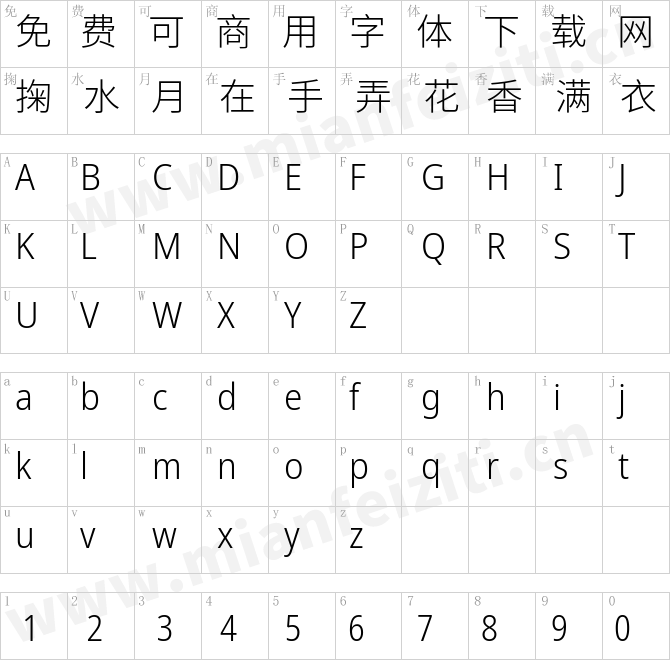
字体介绍
品牌:TypeTogether设计师:维罗妮卡·布丽安(Veronika Burian),荷西·斯卡格里欧纳(José Scaglione)发行时间:2020字库编码:Unicode分类:无衬线体字体属性:
英文名称:Catalpa-Thin.TTF、Catalpa-Extralight.TTF、Catalpa-Light.TTF、Catalpa-Extrabold.TTF、Catalpa-Heavy.TTF、Catalpa-Black.TTF、Catalpa-Ultrablack.TTF、Catalpa-Hairline.TTF、Catalpa-Variable-Light.TTF、Catalpa-Variable-Bold.TTF
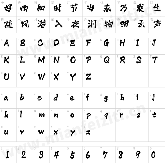
Catalpa字体系列采用JoséScaglione和Veronika Burian源于木型灵感的设计,有强势的标题呈现效果。它没有常规的字重,只有四个纤细的和四个笨重的字重.Catalpa并不是常规的,而是为了强势,突出,咆哮。
Catalpa是三部曲中的第一个字体系列,于2020年发布。这三种字体都有各自的目的和独特的外观,但它们的共同目标是:作为一个完整的系列,满足广泛的需求。 作为三者中的第一,Catalpa用作于标题目的。
一个好的标题字体有什么要求? 区别,字重和内聚力是一个好的开始。 它的独特性必须引起人们的注意,它必须具有适用于其目的的一系列特点,并且其内部一致性和外观必须创建一个具有凝聚力的家族。Catalpa是一个独特而统一的家庭,其字重被调整为统一的目的-标题和大文本。
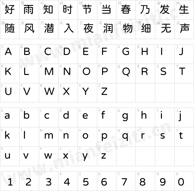
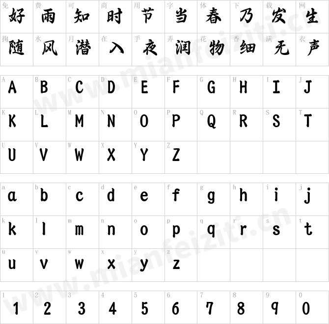
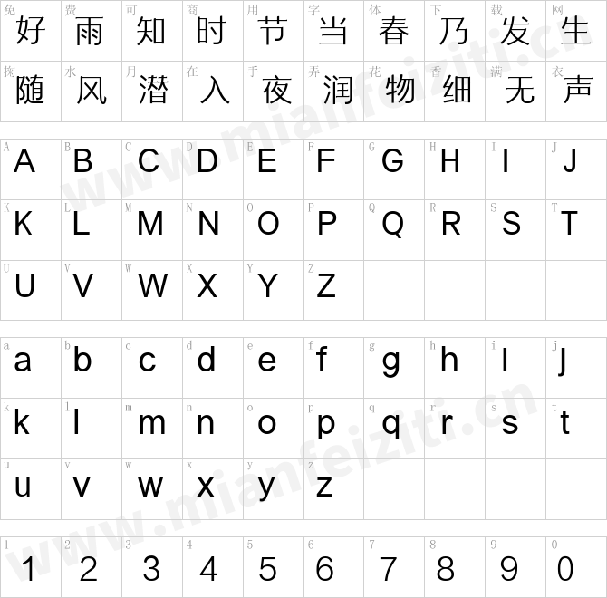
Catalpa只有八种字重,分为两种字重范围-四种非常轻(极细,细线,超轻和轻型)和四种非常粗体的极粗,粗,黑和极黑。 细线和粗线也有自己的可变字体,每种字体都有一个字重轴,因此设计人员可以微调字型。 设计的几何影响在光线范围内更为明显,其线宽以经典方式增加。 粗体字增加了宽度和填充,从而可以更好服务于网站,移动应用程序,海报,广告和杂志,这些应用更注重影响力而不仅仅是传播信息。
作为一个家族,Catalpa经常以大标题,简短句子独立的单词出现。 该系列产品尤其是粗体字重具有许多公认的功能,例如反差“ S,s”或棱角设计“ Q,M,W,w,a,f,2、3”。 Catalpa的顶部内衬混合了几何形状和古怪元素在一起才有了木型设计的特征,更为为基底和屏显设计的。
The Catalpa font family is José Scaglione and Veronika Burian’s wood type-inspired design for an overwhelming headline presence. It has no regular weights, only four slender and four hulking weights. Catalpa wasn’t made to be normal; it was made to overwhelm, to stand out, to bellow.
Catalpa is the first font family within a trilogy that will be released throughout 2020. Each of the three have a distinct purpose and their own look, but they serve a common goal: to act as a complete family covering an editorial’s wide array of needs. As the first of the three, Catalpa is the bookend font family with a headlining purpose.
What requirements are there for a great headline typeface? Distinction, weight, and cohesiveness are a good start. It’s distinctiveness must catch attention, it must have a range of weights applicable to its purpose, and its internal consistency and external look must create a cohesive family. Catalpa is a distinct and unified family whose weights are attuned to its singleminded purpose — headlines and large text.
Catalpa has only eight styles that are divided into two ranges of weights — four very light weights (Hairline, Thin, Extralight, and Light ) and four very bold ones Extrabold, Heavy, Black, and Extrablack). The thin and heavy ends of the spectrum also have their own variable fonts, each with one axis of weight so designers can fine-tune their work. The geometric influence of the design is more obvious in the light range, with their line thickness increasing in the classical manner. The bold weights increase more in width and substance to serve well in websites, mobile apps, posters, advertisements, and magazines that aim for impact more than spreading information.
As a family, Catalpa gels in big headlines, short sentences, and isolated words. The family has many recognizable features, in the bolder weights especially, like the reversed contrast ‘S, s’ or the angular design of ‘Q, M, W, w, a, f, 2, 3’. Catalpa’s headlining mixture of geometry and quirkiness leaves a wide wake that is so characteristic of wood type but designed for substrates and screens.
字体下载
特别提示:
1、本站所有字体仅供个人学习和研究使用,禁止任何商业应用!如需商业用途请自行购买字体的商用授权;
2、一切因使用本站而引致任何意外、疏忽、合约毁坏、诽谤、版权或知识产权侵犯等及其所造成的损失,本站概不负责,亦不承担任何法律责任;
3、本站是一个非赢利性的网站,目的是为优秀的字体进行展示宣传,若侵犯了您的权利,请来信告知,我们将立即处理;如果想在本站展示字体也请与我们联系。
4、联系我们:
Catalpa:等您坐沙发呢!